
Unfortunately, I have misplaced the sketchbook that holds my initial sketches for this project. Once I find it, I will update this document.
I wanted to work with the rovers division of the Space Exploration club as I am very interested in space exploration, and especially Mars rovers. This project gave me a chance to work with the team and the technology, even though I didn't have any experience in engineering or science.
I was given an idea of how they envisioned the logo, and also asked to make it within the same style as the primary SPEX logo. Both are pictured below.

This was a very good starting point, already having a style to follow, and a strong idea to start with.
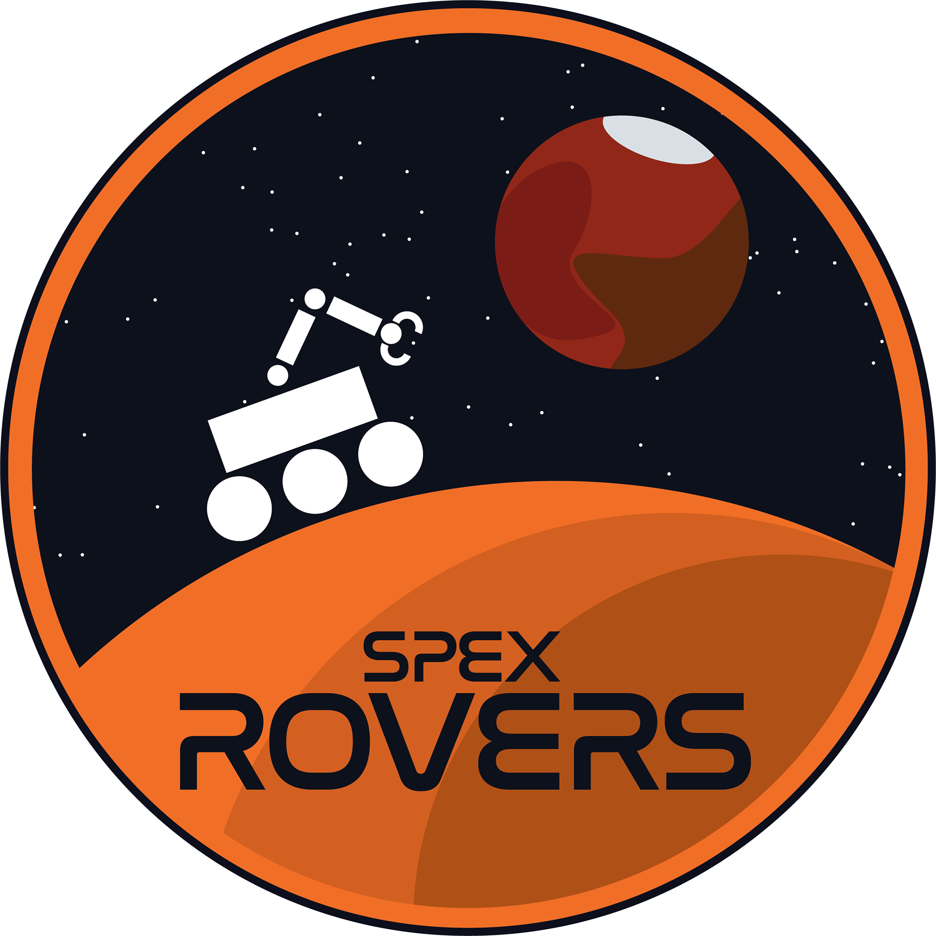
I began by looking a bit more into the main logo, and I was wondering if the stars had any meaning. I discovered that the stars are actually a view of the night sky− as seen from Rochester, NY− on the night the club was founded.
Learning this, I then went to find out when the Rovers division was founded, and did some searching around the internet to find a star map that I could search by location and date. After finding that, I took a screenshot, and made a map of the most prominent stars in an illustrator file. I also marked where mars was, in case I wanted to include that.

Happy with the amount of information I had gathered, I began to work on iterations.
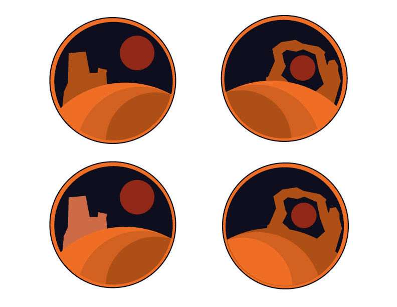
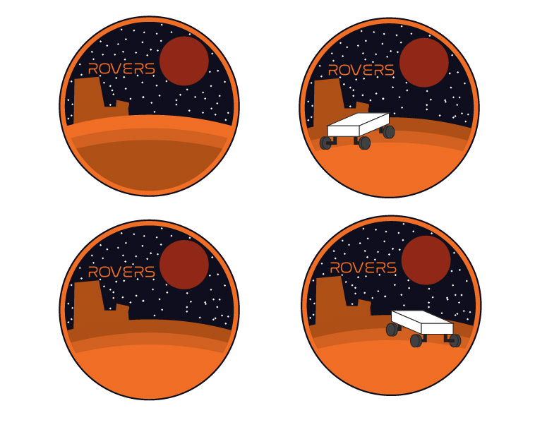
My first batch was very similar to the client's first idea, and I played around with different shapes and positioning of arch type rocks like those found in Utah, where the competition that these rover designs are tested takes place.
My next batch of iterations also included the rocks, but I had begun to experiment with designs of a rover image as well, though mostly for placement and visual balance at this stage. I also began adding text, using Nasalization to match the main logo.
In all of these iterations, I also started using the night sky illustration, and the position of mars matches the map of the sky, though I scaled it up.
In all of these iterations, I also started using the night sky illustration, and the position of mars matches the map of the sky, though I scaled it up.
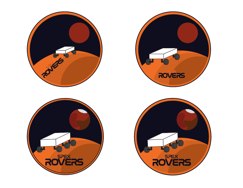
My next few iterations weren't using the starry background. I don't remember why I hadn't used them here, but I quickly returned to them in the next batch.
By this point I had mostly decided on the logo type, and the client and I had agreed that the rover without the rocks in the background was better. I began to try different positioning of the rover within the logo. I also added some simple detailing to Mars at this point.
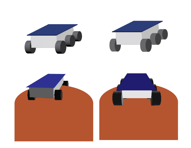
At this point I realized that my first drawing of the rover did not look good. I discussed with the client, and they recommended removing the axles from the wheels, and adding a blue solar panel on top to add some difference in shape and color. I used Adobe Illustrator's 3D system to get the shape and perspective, and then traced the wheels with regular shapes to get the shading
the way I wanted.
the way I wanted.
I tried these new drawings, and brought these iterations to the club.

After trying out this new rover drawing, I wasn't really liking how it was looking. I still wanted to experiment more, but kept these around in case I didn't end up somewhere better.
For my next rover drawings I tried using a couple 2D designs, and being much simpler and more stylized. Unfortunately, I have misplaced the sketchbook that has the sketches for these. I hope to find it and update this in the future.

After bringing all of these iterations to the club, we determined that the third rover drawing was the best, and I began experimenting with different sizes and placements of the drawing within the logo.
Eventually, I settled upon a position that I liked, and brought it to the client. All the members of the club agreed that it looked great, and would put it on the rover and the club's promotional material.

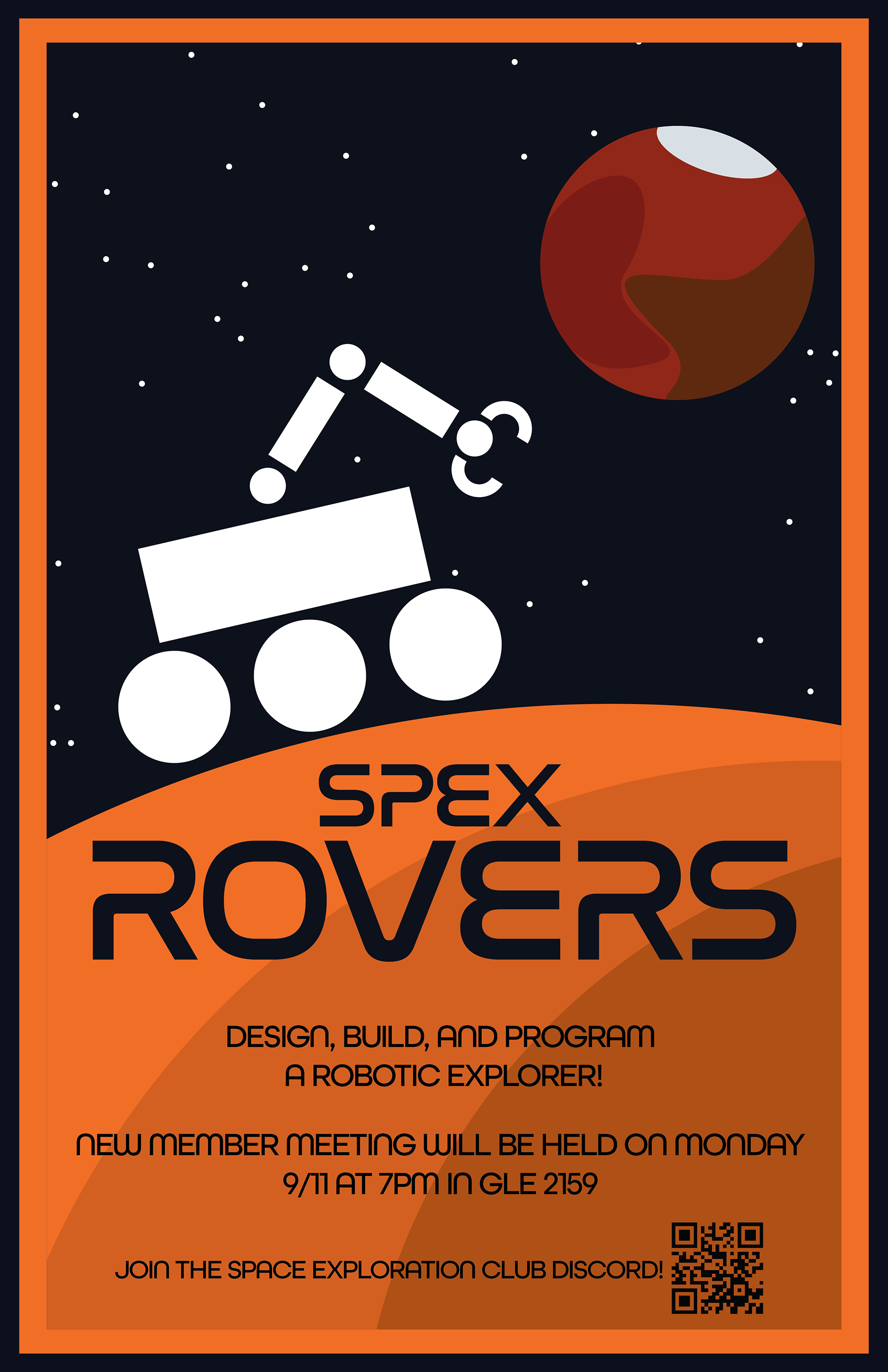
After that, they also asked me if I could make a poster for the year's first club meeting. Due to limited time, I was worried about my ability to get it done in time.
To help with this, I had the idea to use the entire logo as the base for the poster. There was a strong rectangular arrangement within the logo that should translate quite well to a poster.
To help with this, I had the idea to use the entire logo as the base for the poster. There was a strong rectangular arrangement within the logo that should translate quite well to a poster.
I scaled the text and images down to make some room for the body text, wrote up some copy following the requests of the club leadership, and put it together with a nice border to match the logo's border.
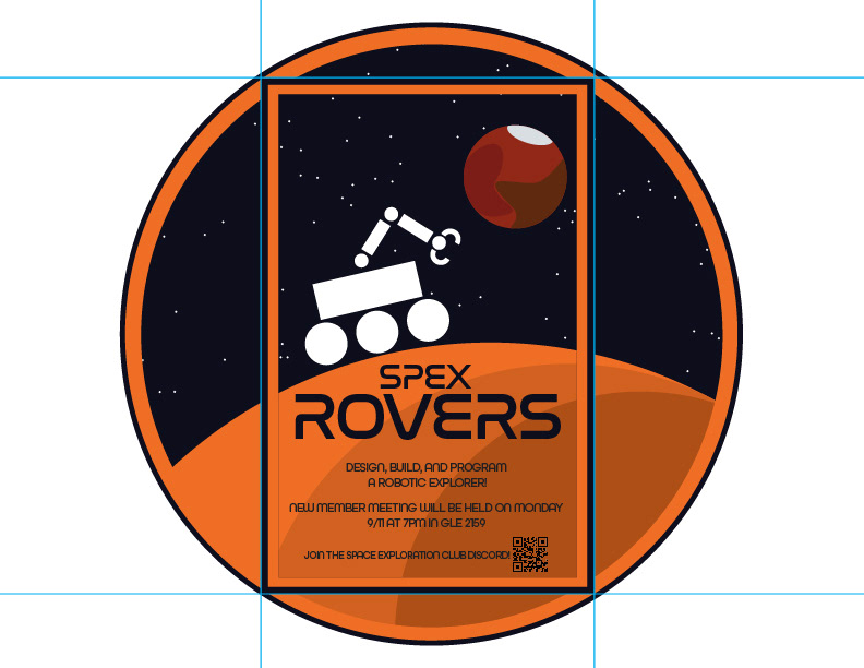
After a few small edits to the text, the club agreed that it looked great, and it got printed that evening and put up the following day around the engineering hall and a few other school buildings.
Overall, I found this to be a great experience. This was not my first time doing client work, but it was the first time working with a client that was so relaxed with deadlines. I needed to keep myself motivated to keep up work on the project, as there was no one around me who would keep me on track and getting consistent progress done.
I also learned that even far into a design, it isn't too late to pivot and change it. I couldn't let myself get too attached to any iteration of the rover drawing, no matter how long it took; otherwise, I never would have reached the design I landed on in the end, which I am very proud of.
I also learned that even far into a design, it isn't too late to pivot and change it. I couldn't let myself get too attached to any iteration of the rover drawing, no matter how long it took; otherwise, I never would have reached the design I landed on in the end, which I am very proud of.