This was a project for my Information Design course as a junior at RIT.
The brief for the project was as follows:
The brief for the project was as follows:
This project is based on designing an information design intended towards your assigned topic. The project needs to engage and entice, have the ability to get attention, often through an arresting or memorable image that presents a different perspective, communicate a convincing argument by summarizing complex concepts and communicating them through an aesthetic that the intended audience will respond to, Draw the viewer in giving them a way to connect directly to the content or explore the issue further.
I struggled quite a bit with this assignment, but I believe my end result was all the better for it.
I went through many completely different concepts before settling on the final design.
I went through many completely different concepts before settling on the final design.
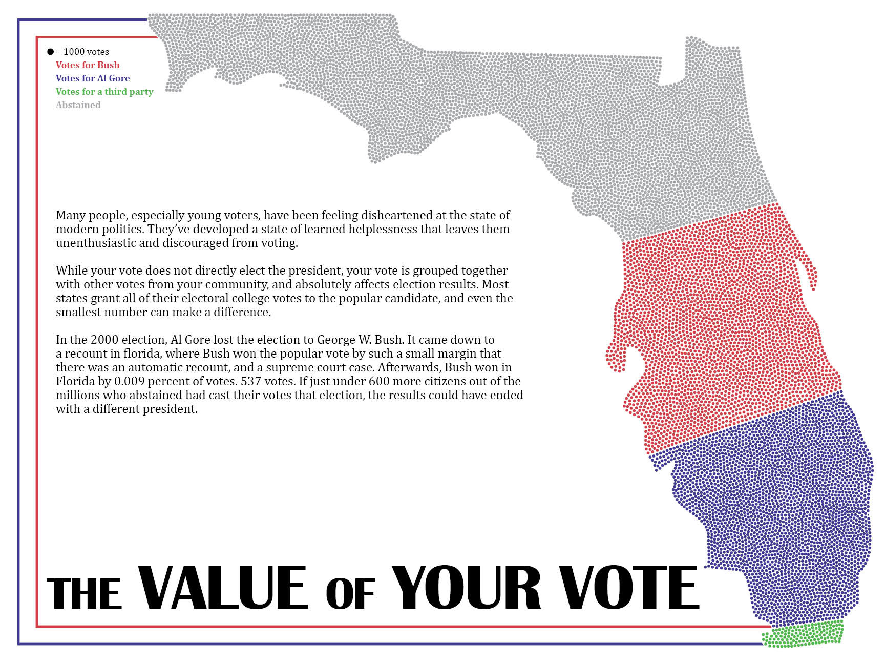
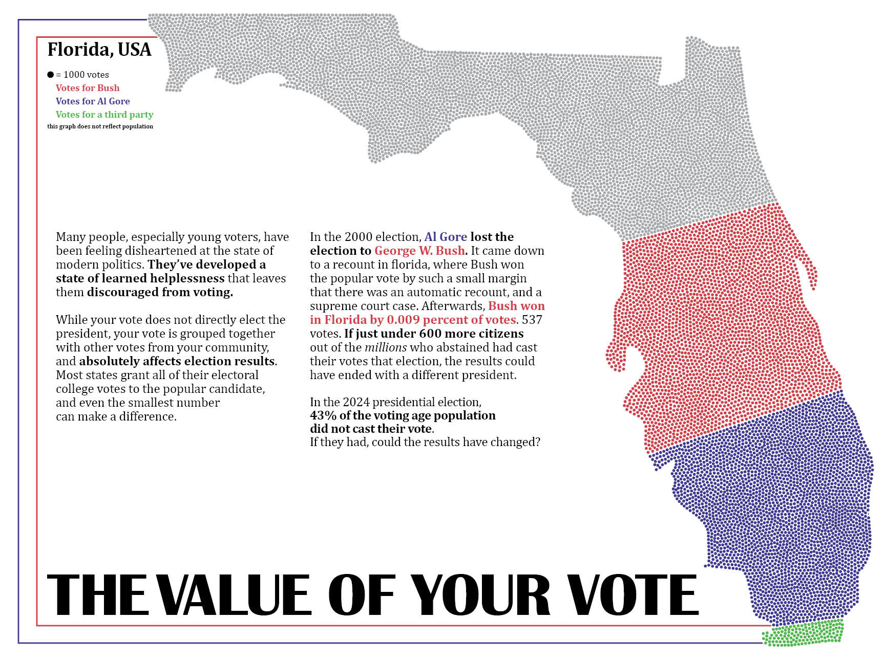
The first step was to research and figure out what my poster would focus on. The topic I was assigned was voting, so I needed to find data and decide how to use it.
For my first poster iteration, I was inspired by the classic "I Want You" poster from WWII. I traced a photo of my own hand in illustrator, put together a similar layout with the border and text, and filled in the rest of the text and imagery from there.

After this first iteration, I decided that the contrasting yellow and green did not fit well within the design. I got rid of them and just stuck with the red, white, and blue.

After reviewing with my professor, I was told that my design was too busy, and I should take a step back and focus on one piece of information with one image.
After some messing around with different ideas to show what was essentially a bar graph, and experimenting with a program within illustrator that could place shapes within other shapes, I decided upon filling the shape of Florida with about 11,000 dots (a 1/1000 scale of the voting age population of Florida in the year 2000)
Then adding the data from the 2000 election in a written form.