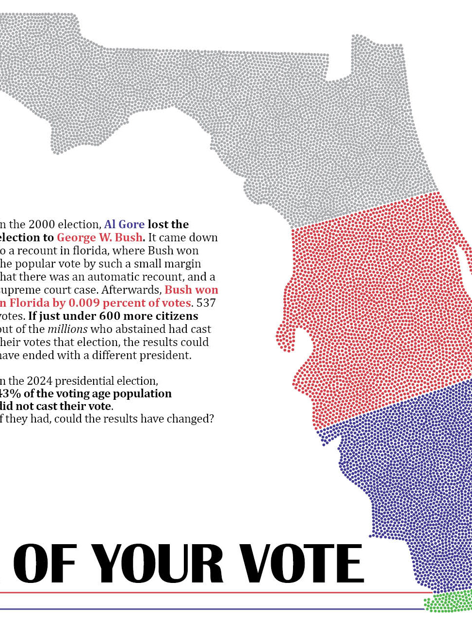
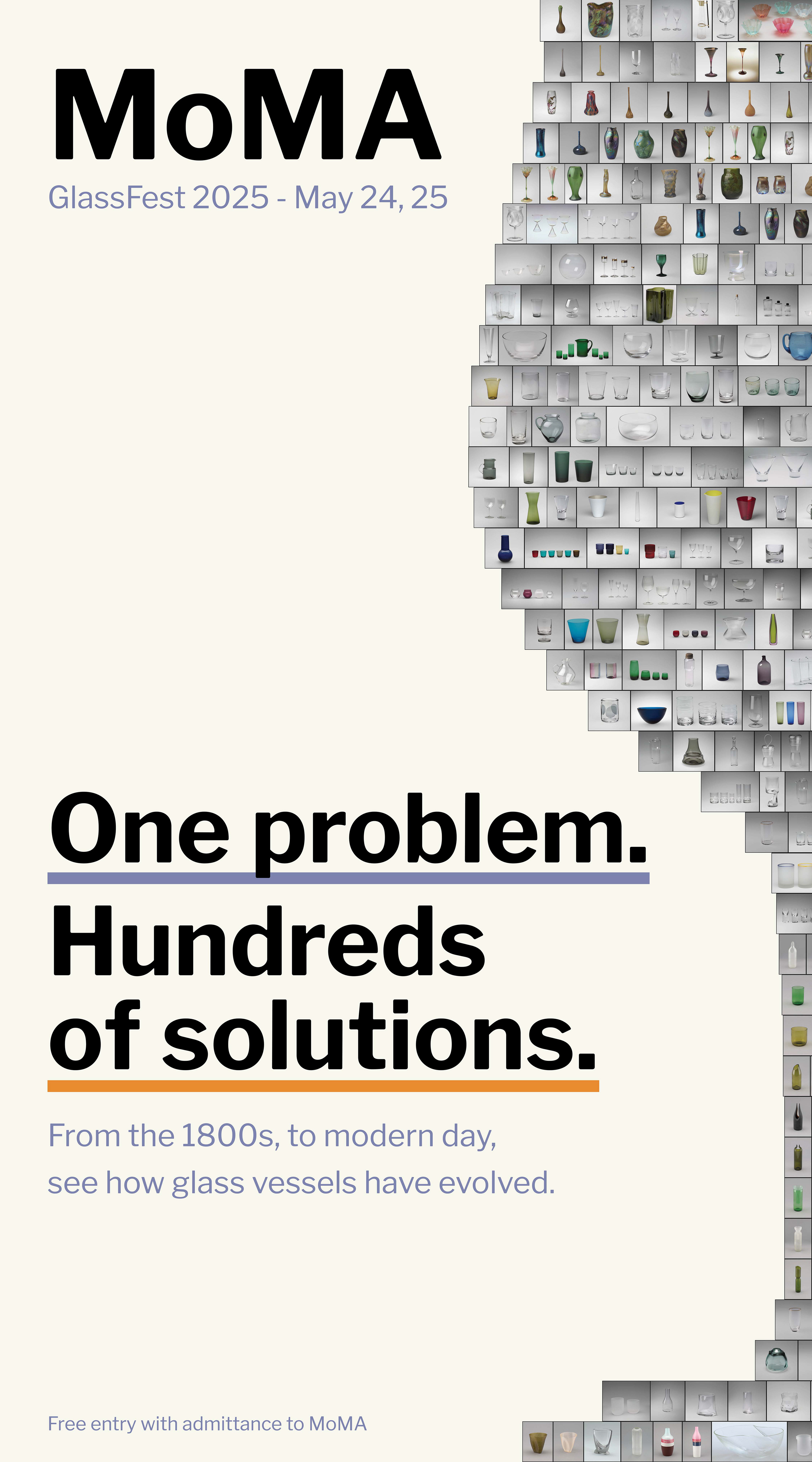
In this project, I was challenged to make a piece of promotional material for a made-up event. I was required to use data and information from the Museum of Modern Art in New York. I was not required to make it in the style of MoMA's advertising, but I chose to challenge myself to work within those limitations.
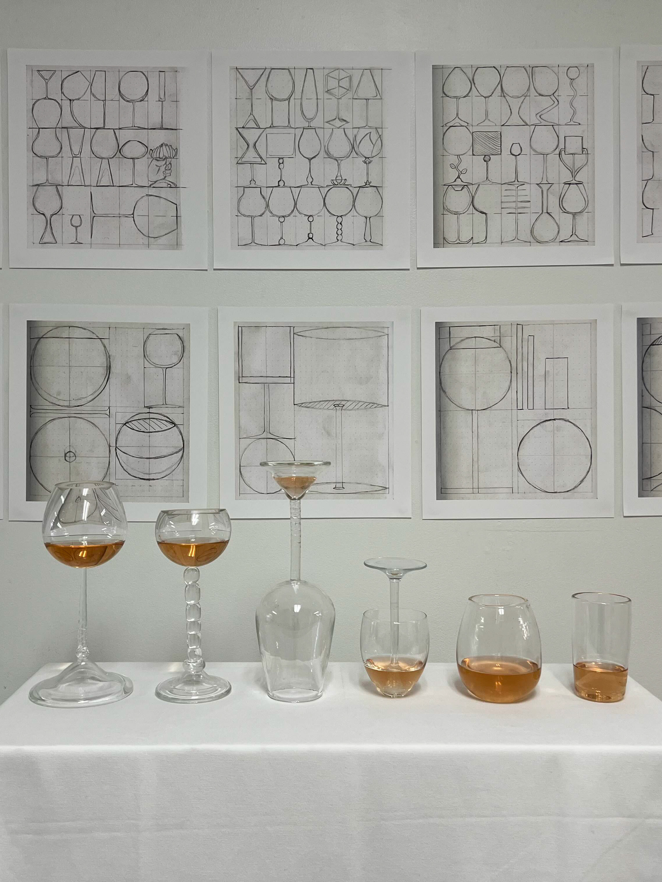
The first step was to identify the information I would use for my design. With so much data and so many artists, pieces, and different points of information to work through, this task was very intimidating. To narrow down the information to start, I chose to only look at glass, as I am taking a minor in glass at school. After looking through many different more specific limitations in the data set, I chose to work specifically in glass vessels, anything to hold other materials within it.
Once I had my topic chosen, I did research into MoMAs advertising style. I found that their style focuses heavily on simplicity and very strong grids. After having that figured out, and looking though a sample of the images on MoMA's website, I began to sketch out some possible ideas.


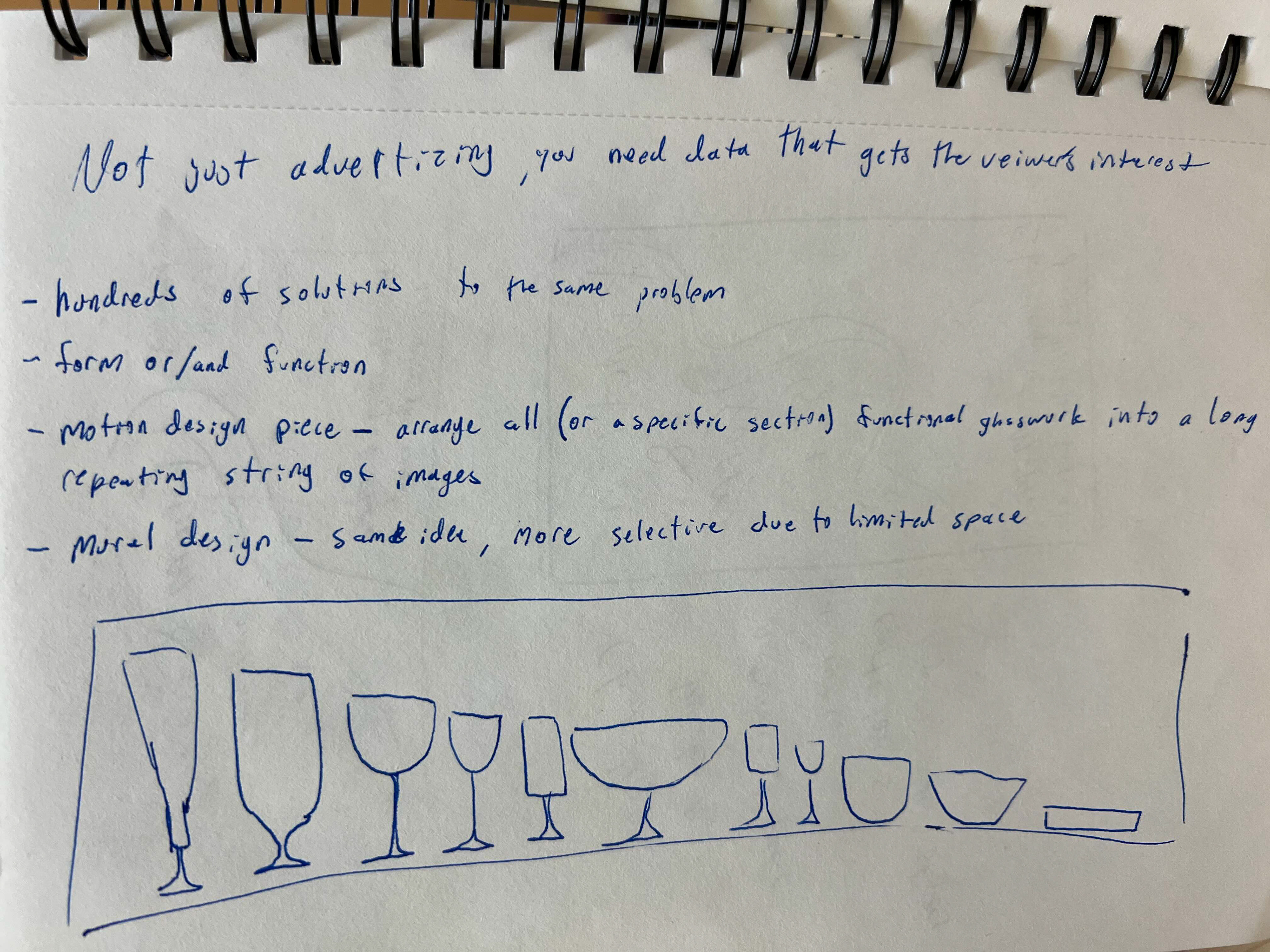
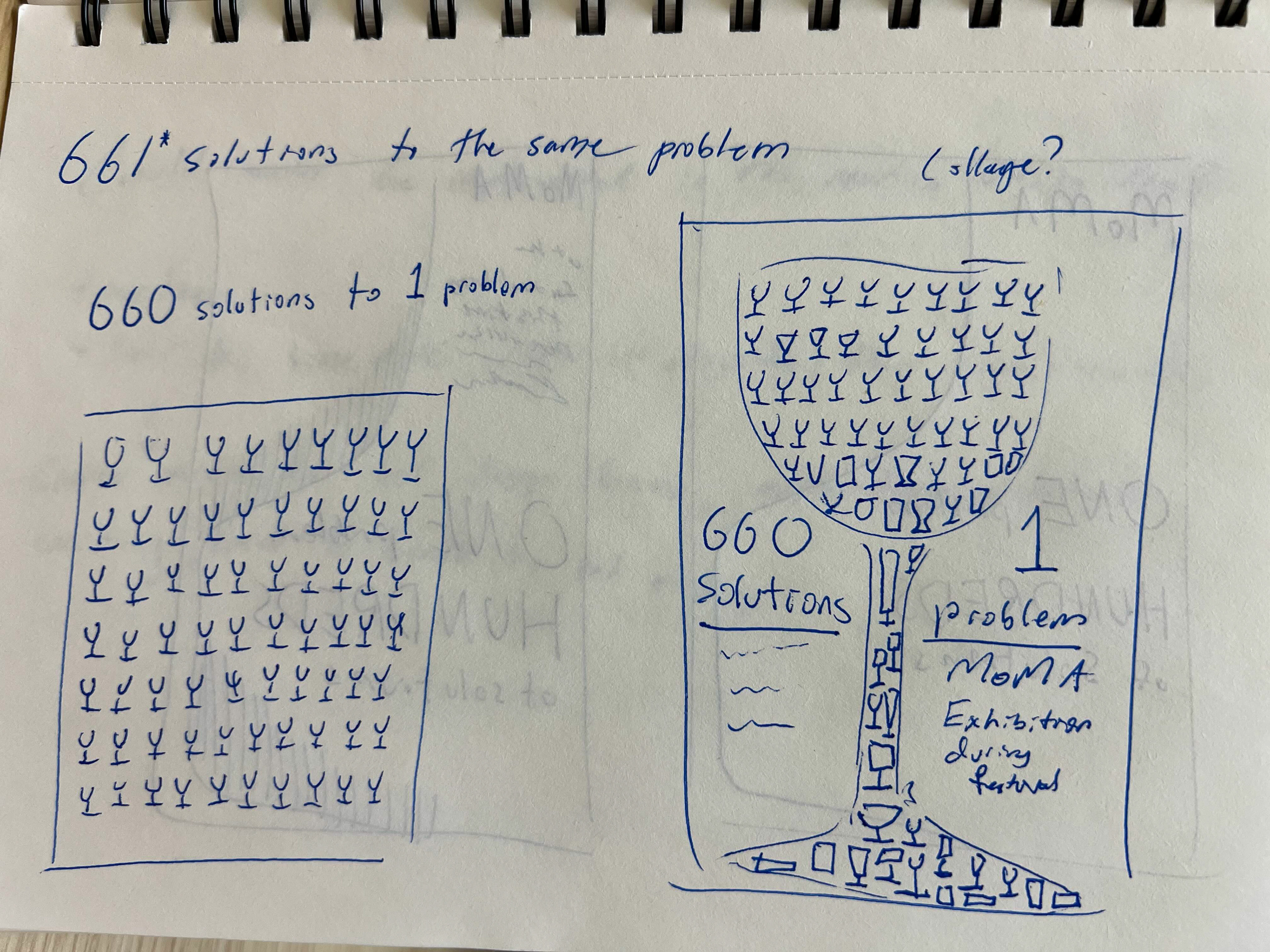
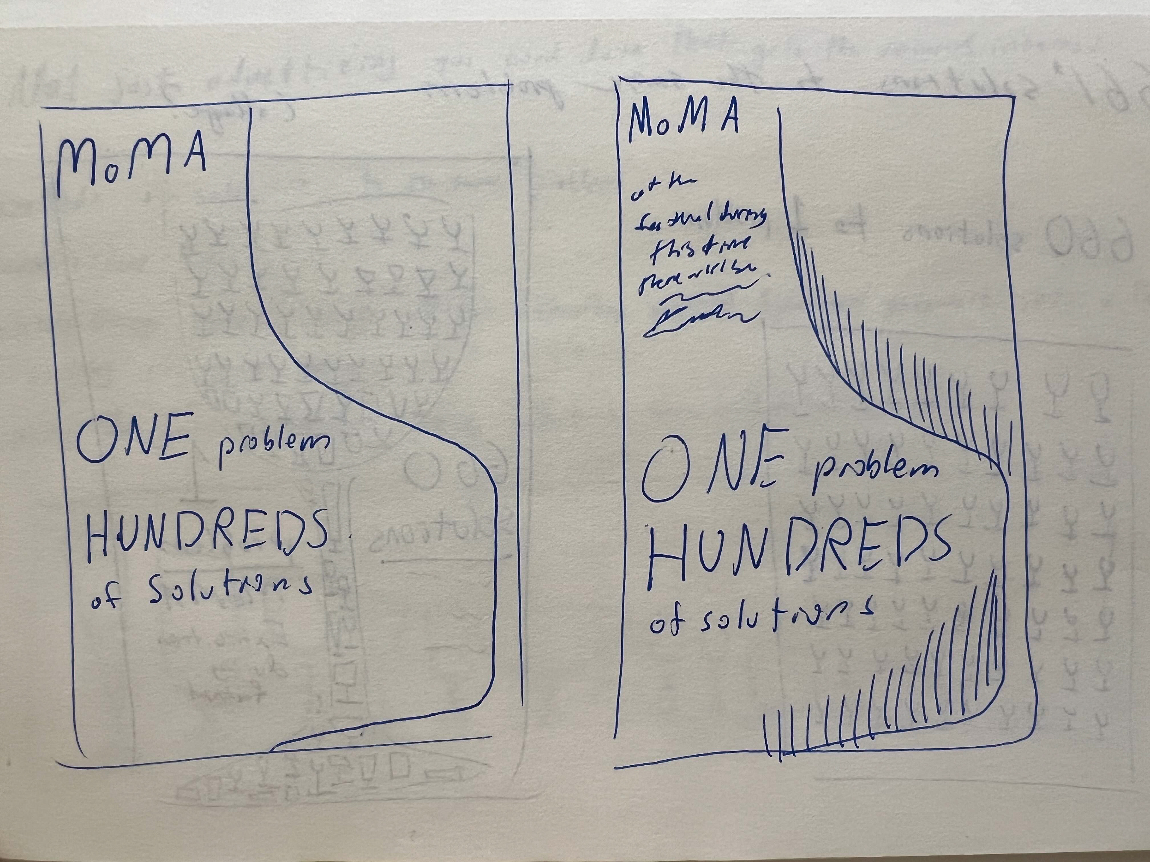
At the start, I had a few ideas that were more abstract visually, and focused on the idea of functional and aesthetically pleasing objects. After a few ideas, however, I began exploring this idea of using many images of different glass vessels and the thought of all of them being designed to hold liquid, but doing it in very many different ways.
I decided my two strongest ideas were a mosaic style image using pictures of vessels to make a larger image; or a motion piece or long format poster that would show off different designs all lined up in a row. I made moodboards for both of these.
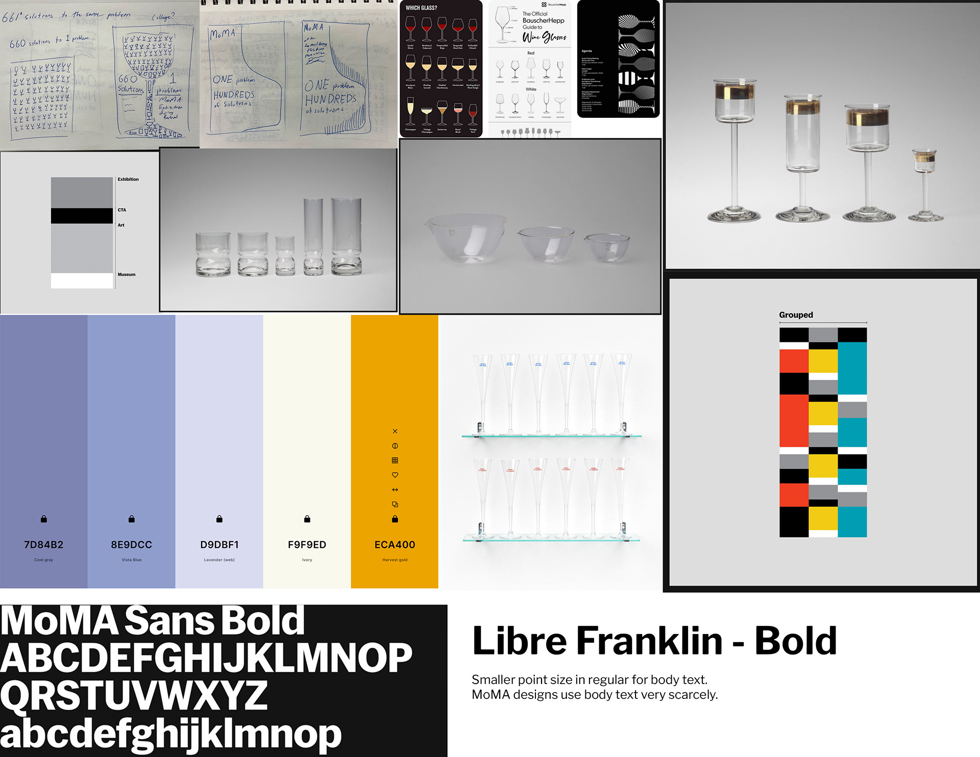
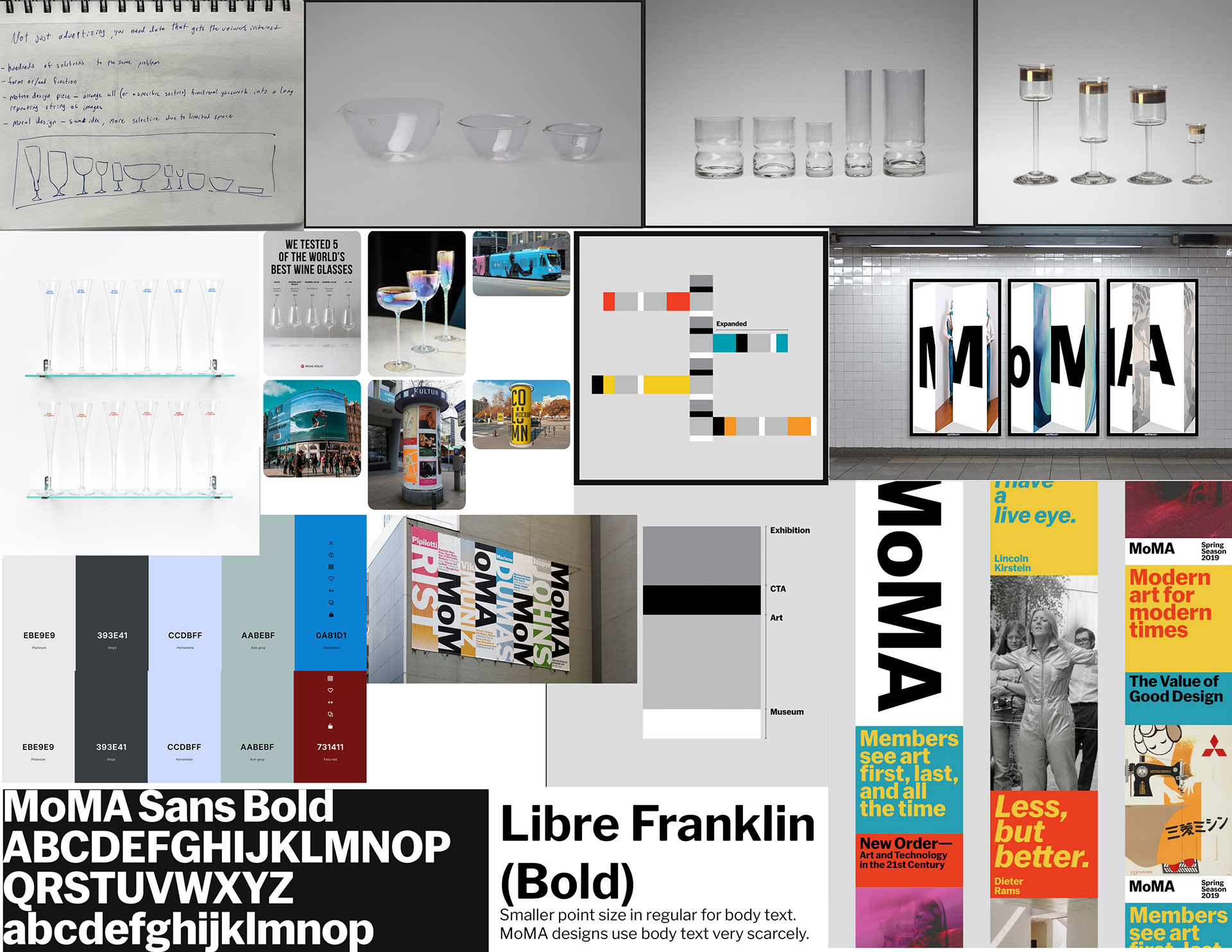
These are the moodboards I came up with after studying their style, as well as a few of the glass vessels on MoMA's website. On the left was for an concept I had that revolved around the idea of making a mosaic of images of glass vessels to make a larger image of a vessel. After discussing with classmates and my professor, I decided to go for the poster, as I felt that limited time would prevent me from making a motion piece that I would be proud of.
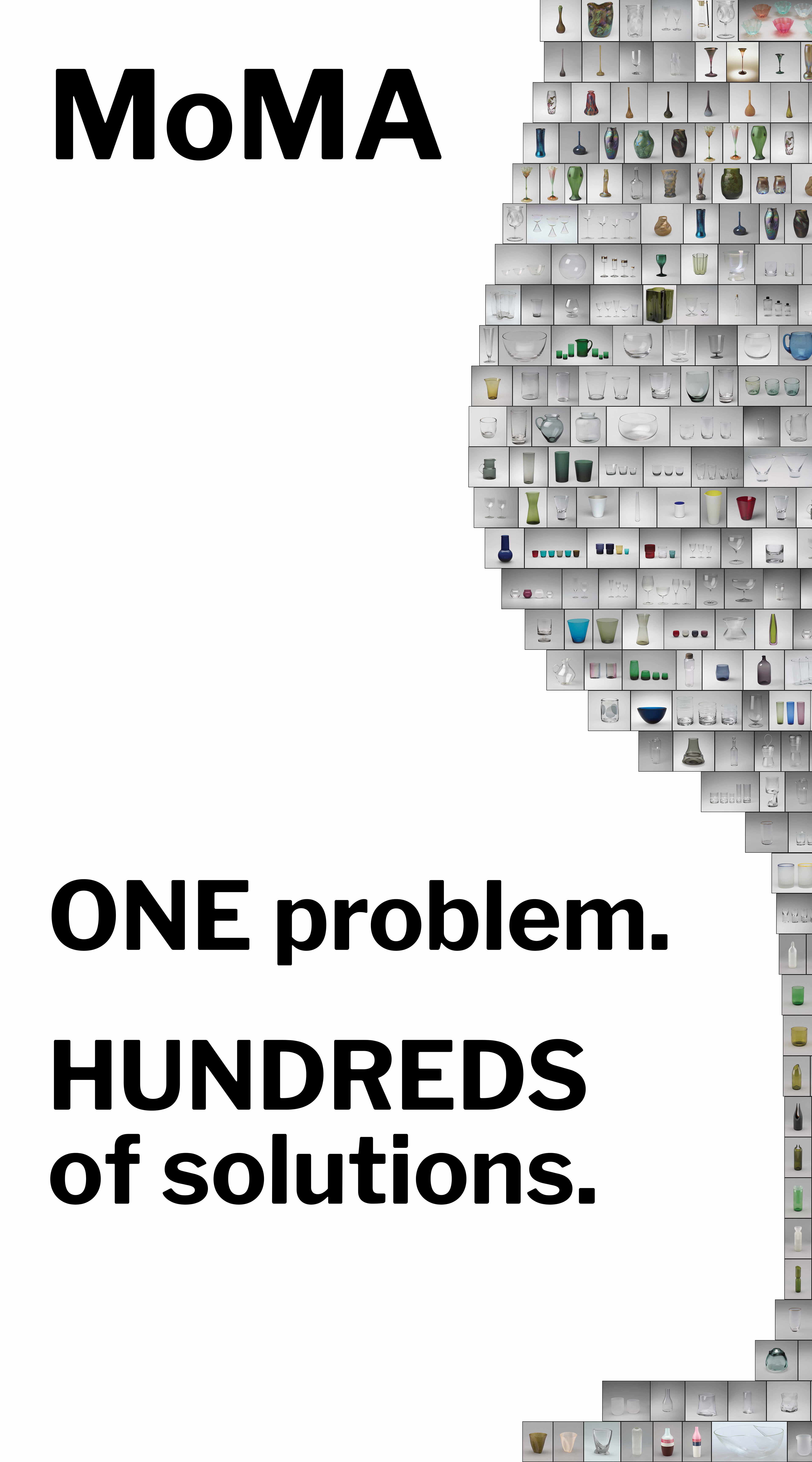
My first draft focused mainly on getting the main text and the mosaic done. All 175 images were placed manually and adjusted to make the shape I wanted. I did this in InDesign so that the images would not be embedded, keeping the file size lower.

Next, I changed the background color and added some color accents to the text.

In my next iteration, I added some body text for context on the event.
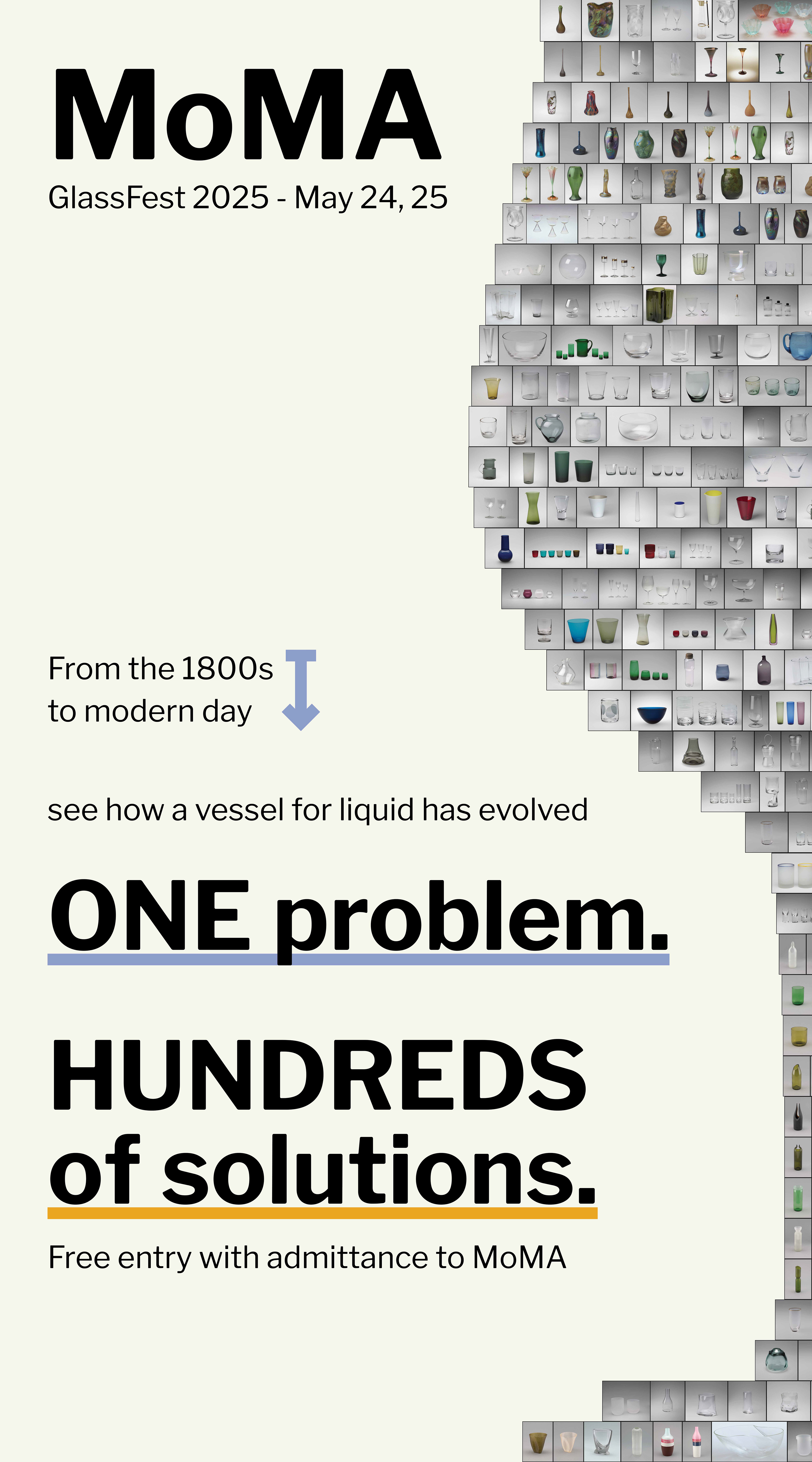


Next, I experimented a bit with this little arrow to represent a timeline between the 1800s and modern day. I also experimented a bit with changing the color and position of the text.
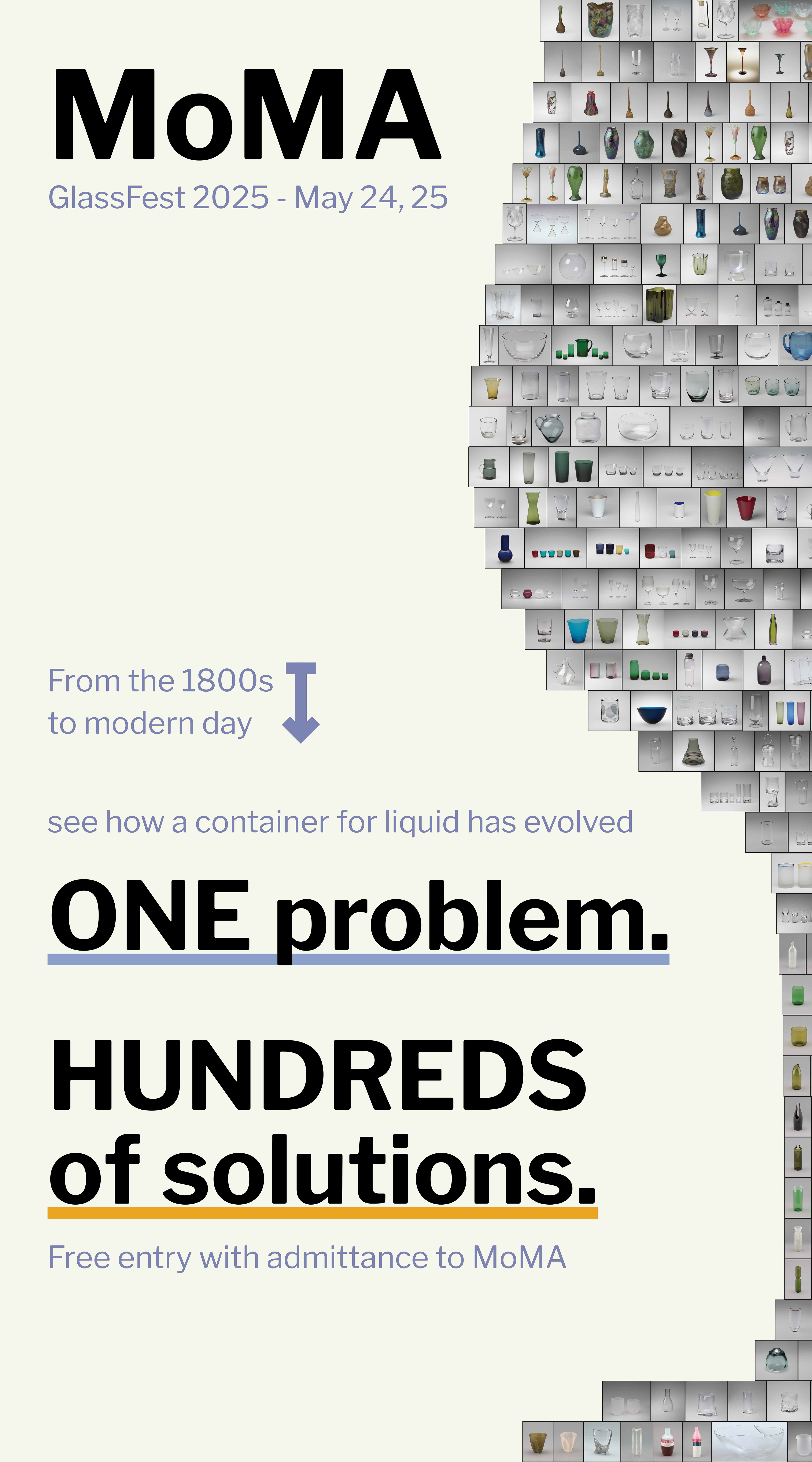
After discussing with friends and classmates, I eventually decided against the arrow,
and arrived at my final solution.
and arrived at my final solution.